Doc Savage is the most well known precursor to
modern-day super-heroes, and several authors have already noticed the striking
similarities between this Man of Bronze and Siegel & Schuster’s Man of
Steel. In fact, Doc Savage stands in the unmarked frontier between pulp fiction
and comic books, serving as the prototype to both Superman-like heroes and
Batman-type action-detectives, as well as several other tropes. In his
crime-fighting and adventurous career, Savage fought criminals, mad scientists
and natural monsters, including dinosaurs, and had to survive firefights,
crashing planes, sinking subs, fires, explosions, and everything else ‘Kenneth
Robeson’ (mostly Lester Dent) could think of. As a result of such extreme
adventures and near-misses, the tattered shirt of Doc Savage became a permanent
fixture of the character in such diverse media as pulp covers, comic books,
graphic novels and films, functioning as a signifier of extreme violence. By
means of contrast, injuries were kept to a minimum, mostly never more than a
broken lip or a bleeding nose. It was as if the damage suffered by his
costume/clothes stood for the intensity of the violence he had to suffer
through. Very much as it goes in cartoons (printed or animated) where a
character (say Bugs Bunny or Donald Duck) after surviving an explosion, is
shown with body blackened and clothes in tatters for a few seconds, before
regaining his normal un-disheveled appearance. And such graphic practice was
transmitted to comics from its very beginnings.
As I will explore in my next post (the last of
the two-year-in-the-making introductory posts to this blog), the superhero
costume is very much part and parcel of the hero’s identity and personal
definition; something that shouldn’t need further explanation as through the
years we’ve seen different characters assume the mantle of iconic super-heroes
like Batman, Batgirl, Robin, Captain America, Black Panther and such, implying
that besides the particular powers specific to each character, it truly is the
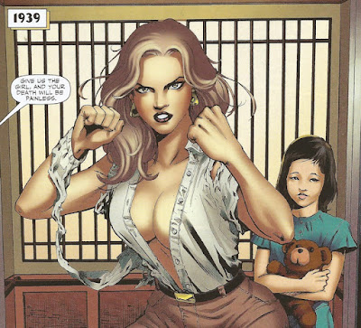
costume that makes the hero. Even when, as is the case with Doc Savage, the
costume is merely defined by tattered clothes, something equally valid when
dealing with Savage’s own female version: his niece Pat Savage.
I’ll admit that what I’m about to posit needs a
little more statistical confirmation, but I’ll advance it anyhow in the spirit
of impressionistic empiricism: as Mulvey, Dworkin and McKinnon’s
unsubstantiated assertions on female objectification and identification of sex
with violence drove feminist and extreme-right reaction against female (and
even male) exposed flesh, comic book creators started putting forth lame
explanations for costumes not to get torn to shreds.
I guess one can set CRISIS ON INFINITE EARTHS as the representational turning point,
with a bevy of costumes being torn as entire earths and heroes were swiped
clean, culminating in the torn and bleeding Supergirl dying with her costume in
tatters, a confluence of torn costume and injuries, and a vision not soon to be
repeated. In his re-imaginings, Byrne would erase the smallest rip from
Superman or Wonder Woman’s costumes, with ridiculous explanations of bodily
auras that would protect the cloth in contact with the hero’s skin, and
generating endless jokes about the incredible number of capes Superman had to
replace.
However, as the successive torn capes made
clear, even Byrne felt that the costume in tatters was the best way of
representing the outcome of physical violence, short of representing the real outcome of violence itself. That
is: broken teeth, black-and-blue pulped flesh, broken bones and lots of blood.
And, in a way, that’s the way comics went under the neo-victorian code of
representation. Intact costumes would demand and bring forth ever more
excessive degrees of physical violence. Thus, we went from something like
this:
to things
like these:
Of course, for the progressive
politically-correct noisy minority, violence is always preferable to sex, blood
to breasts, death or mutilation to pin-up poses, better to allow them to
hypocritically rage over their filled-to-capacity refrigerators. And so, the
blood for intact costumes mode of representation became dominant in the major
publishers, and affected both male and female characters. Case in point, one of
my first pre-adolescent objects of desire: Ms. Marvel (Carol Danvers).
In the seventies, after she emerged from the
shadow of Capitain Marvel, Carol Danvers became one of the most popular female
superheroes, Marvel’s worthy response to DC’s more tame Supergirl (also a
Danvers, and my first ever comic book crush), even if not to ür-Superheroine,
Wonder Woman. Hailed as a feminist and progressive icon (something over which not all
feminists are in agreement – what else is new?), she nonetheless
figured in two cult-covers from her own magazine, where torn costumes are used
as effective pointers to the level of menace facing Ms. Marvel (even if not at
all faithful to the stories within).

Both covers substitute the torn costume for any
bloody signs of violence, which could be confused with topic domestic violence,
or battery and assault (and Odin knowns the sexual readings that radical progs,
fed with Freudian-mush, already get out of the covers as they are). But, as I
stated above, torn costumes had to go, to be replaced by more overtly violent
graphics. Now the question is how to represent that level of violence when the
one on the receiving end is a super-powered, practically indestructible,
super-being, without letting it slide into cartoon caricature? And the answer
is: not easily.
Let us consider MS. MARVEL #18-24 (2007-2008), a set of books that comprises the “Puppets”
and “Monster
and Marvel” story-arcs, both of them easy fodder to varied readings and
interpretations. However interesting as
they are (and I intend to do a go-over around “Puppets” in the future),
it is not the stories per se that I
want to tackle now, but the graphic representation of violence, as it escalates
towards a maximum of absurdness of which the creators seem not to be aware.
It begins in MS. MARVEL #18, when our heroine is hit point-blank with a grenade
that literally explodes on her face without causing the smallest rip on her
costume.
If one was to take that as a little bit absurd
but still within the bounds of comic
book logic, issue 20 brings a quick escalation of power-yield, as Carol
once more comes out unscathed from what appears to be a multiple-megaton blast.
Needless to say, despite emerging from the
blast amidst a maelstrom of raging fire, her costume remains equally unscathed.
Immediately in the same issue, Ms. Marvel’s
quarters aboard a S.H.I.E.L.D. light helicarrier are destroyed in another
impressive explosion when hit by an alien missile.
And again, there seems not to be any amount of
energy capable of damaging Carol’s costume:
But if you thought that impressive, by issue
#21, Carol drops from the outer atmosphere of some alien world… in her pajamas…
which miraculously come equally unscathed from the fall and the friction and
the heat generated by both.
And there’s
no way in hell that repeated references to the “blue stuff inside me” can
explain the indestructibility of Carol’s clothes. And it doesn’t stop here, as
the creators (writer Brian Reed and penciler Aaron Lopestri) go one over the
top and in MISS MARVEL #24 don’t shy
away from a good-old nuclear blast at close range in the plain vacuum of space:
It is a
spectacular blast that sends the equally indestructible alien creature
careening through space, gaining Ms. Marvel – and Earth – some well needed
time.
Of course,
once again, both Ms. Marvel and her unbelievably resilient costume survive
unscathed, even adding another vertiginous fall through the atmosphere.

Both story
arcs from which the images above were selected are told with verve, both literary
and visual, and one comes out of them with a distinct impression that its
authors are aware they are straining the good will of their readers in
accepting that a mere piece of cloth could survive such rough handling; not
only that, one senses they know their readers will swallow it whole, because
not to do it would be politically
incorrect. (Surely they wouldn’t believe their story was so brilliant one
wouldn’t notice how synthetic fabrics can withstand nuclear explosions and
temperatures as close to those of the sun as they can get.) Underlining these
impressions, is the fact that in MS.
MARVEL #21 the issue of Carol Danvers/Ms.Marvel’s identity is broached in a
pertinent way, denying any exceptionality to Carol/Ms.Marvel’s costume: “We’re
the same person. I am Ms. Marvel. It’s just a costume”.
Now, one
can argue that something in Ms. Marvel’s powers can keep her clothes intact;
not only her uniform, but also her pajamas. That somehow, Carol’s
invulnerability extends to whatever she’s wearing. But how could this happen?
True, in issue #23, Carol discovers that the
alien Cru can “turn her powers off”. Certainly that could explain how the
alien’s sting could penetrate through Carol’s costume and Carol’s flesh. Bu
then how to explain this in MS. MARVEL
#19?
Despite
catfighting Tigra (no pun intended) for over two pages (ok, one’s a splash
page) and then tackling Silverclaw for two more, Ms. Marvel comes away bleeding
from her torn cheek, but with her costume absolutely pristine: again, with
costume intact in order not to raise the ire of the righteous left, it is
necessary to draw (pun intended) blood. (It is true that in the story, the
scratches on Carol’s face are a contrivance used to subdue Ms.Marvel through a
toxin in Tigra’s claws, but that does not explain how could the striped
ex-Avenger break Ms.Marvel’s atomic-blast-proof skin.)
I think I illustrated
– although briefly , and without delving
too much on the details of both story arcs, resting on a more visual
approach – how I think that the politically correct refraining from present the
female characters in ways that could eroticize them through too much exposed
flesh , or even equate too uncomfortably eroticism and violence (not that they
are mutually exclusive, quite the contrary, but remember this is literature for
children – some, quite sophisticated children, but children nonetheless) led to
the need to represent more blood and bodily maiming to convey the same degree
of danger and menace that yesteryear was conveyed by torn clothes.

So it is
that we see Carol Danvers scratched and bleeding, with her back torn by the
barbed tendril of Cru, blood running like gravy from her rendered flesh, but
with costume proper and primly intact, surviving explosions and nuclear blasts.
Carol’s costume in this pages seems like the huge elephant in the middle of the
room, that everyone is pretending no to notice. And more than following comic book logic, it calls our
attention for nothing as much as those old Disney comics: for kids, you know!


