Monday, October 31, 2022

Happy Halloween!


Cover by Curt Swan & Stan Kaye

Although it has no relation to the cover above, today being Halloween and all that made me think of one of the Superman’s sixties and seventies stories aspects I enjoyed more when I was a kid: his weakness when confronted with magic. In some way I find hard to explain, his susceptibility to the supernatural was something that resonated with me much better than the more prosaic kryptonite. But then again, maybe because DC (mainly during the reign of Julius Schwartz) is so closely associated with the material world of science, whenever the supernatural intruded its effects were much more chilling than, say, in Marvel Comics.

Maybe that’s why Deadman, The Phantom Stranger, Etrigan, or Solomon Grundy had a more lasting effect in me than Ghost Rider or Morbius, the Living Vampire. Marvel, obviously, excelled with Lee and Ditko’s Doctor Strange, and few characters left a more iconic impression of villainy than The Green Goblin (again, through Ditko’s horror attuned imagination), but few stories had more impact on me than Wolfman and Perez’s Brother Blood Saga from NEW TEEN TITANS back in the early Eighties, or the initial run of SWAMP THING by Wein and Wrightson.

Except, maybe, for the one I have the fondest memory of: “The Monsters Among Us!”, written by the same Len Wein (with Paul Levitz), and penciled by Curt Swan (inked in this issue by Frank Chiaramonte), from SUPERMAN # 344 (cover dated February 1980). That’s the story I always remember each time the leafs fall from the trees and the full moon rises behind the naked branches of crooked trees on Halloween night.

So, Happy Halloween, folks!

Cover by José Luis García-López

Tuesday, July 27, 2021

Peeking into an Alien World

When I was a kid, you wouldn’t caught me dead with a romance comic book in my hands. In fact, I never read a Romance comic book in my life, and what led me to DARING LOVE #1 was Blake Bell’s reference to it in Strange and Stranger: The World of Steve Ditko (Fantagraphics Books, 2008) as containing Steve Ditko’s first published work (the final story of this one-shot issue, the six-pager “Paper Romance!”). The first thing that stroked my attention was the amazing cover by Bernard Baily, that I appropriately found on a wonderful summer afternoon this past week, not unlike the one depicted on it. 


 The girl on the cover reminded me of Martha Vickers in 1946’s THE BIG SLEEP, when Bogart/Marlowe first visits Sternwood’s mansion, legs up to her waist and sunshine in her hair. The golden hay she’s reclining on serves as a rich reminder of the summer heat outside the barn, where one can easily imagine the air shimmering with heat waves rising from the dry ground. A cover about endless summers gone. A wonderfully nostalgic cover, resonant in its clichéd simplicity.

A cover I’m sure I would have loved had I found it when I was a young kid in love with Kara Zor-El. And that led me to think of how would my younger, kidder, self, have found such a comic book like? Yes, me, who thrilled with cowboys and Indians shoot’em ups; who brandished wooden swords side-by-side with the likes of Sandokan and Robin Hood; who played Star Wars with my gunslinger plastic cowboys; who enjoyed binge-reading huge piles of Donald and Scrooge Walt Disney comic books, that were only (albeit, promptly) set aside when I glimpsed my first Superman comic book on the corner’s newsstand where my father used to buy his paper?   

Braving beyond the cover, my younger self would have found a world more alien than Krypton, weirder than any of the planets where the Enterprise’s red shirts went to die, peopled by aliens as gorgeous as Supergirl, but as distant as the most sinister creature from the unknown pits of Mongo: women in love!

“The Price of Fame”, ALL LOVE #27 (1949), pencils and inks by L.B. Cole

Of course, women in love were a species known to occupy any entertainment habitat, from adventure serials to cerebral science-fiction. They were always hindering, or helping, our heroes. Most of all, they seemed to have the most pronounced proclivity for being in danger and in need of rescue. They were mostly blonde, sometimes brunette, seldom redheaded, and never, never, black-haired. Those were the femmes fatales. The villainesses. But neither of them were ever shown quite like this.

“Dear John”, DARING LOVE #1 (1953), pencils by Gerald Altman and inks by Jon D’Agostino

There, one would have found women in their own secret identities as,well… women, speaking in terms unheard of, as aking to any alien language as Klingon or Swahili, but looking so utterly and unexpectedly gorgeous as any kid could have never imagined on the pages of PALE RIDER or ZORRO.

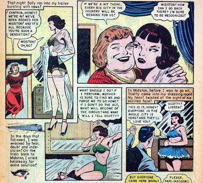
Of course, I don’t believe I would have recognize them as any of the girls that were usually around my heroes. Sure, they were equally pretty and alluring, but would seldom reveal more than a round shoulder through an expertly torn dress. I wouldn’t ever imagine that even when preparing to brave a snow storm to take some important plea to the governor, our heroine would take care in smoothing her stockings:

“Terror at Tarn House”, LOVE MISTERY #1 (1950), pencils and inks by George Evans

Nor would I ever have imagined, from the height of my twelve-years old innocence, that it could be such a recurrent and sensual gesture, one that we never saw Supergirl or Batgirl performing.

“Too Young to Love!”, INTIMATE CONFESSIONS #2 (1951), pencils by Walter Johnson

And, despite knowing that Supergirl and Batgirl and Wonder Woman had to change from their secret identities to her super-heroine personae, one would never had suspected that under their blouses and skirts any of those wonderful girls – Linda Danvers, Barbara Gordon, Diana Prince – would wear a bra and panties, and least of all, stockings! For all the times one would see Linda Danvers rip her shirt open, just like his more famous cousin, one never got to see what was beneath the blue leotard with the exciting s-shield that always got in the way.

Not so in these Romance comics; here one would glimpse the truth beneath the exterior façade, the secret accoutrements that remained more hidden than Superman’s identity as Clark Kent. When these girls changed clothes, there was always a second tier of intimate protection that bore no resemblance to colorful out-of-this-world costumes.

“Kissless Bride”, FORBIDDEN LOVE #3 (1950), penciller and inker unknown

“The Inner Fire”, FORBIDDEN LOVE #4 (1950), penciller and inker unknown

“Two Wayward Girls”, INTIMATE CONFESSIONS #2 (1951), pencils and inks by Louis Zansky

“Love for Sale”, FORBIDDEN LOVE #3 (1950), pencils and inks unknown

“Heartbreak Road”, FORBIDDEN LOVE #1 (1950), pencils and inks unknown

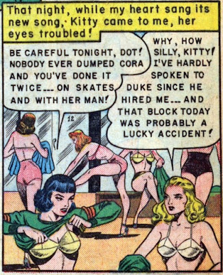
Although their conversations and musings kept sounding like alienese, one would win insight into the they-to-day life of these strange and fabulous creatures. One would follow them into the locker-room and be privy to what went on in there.

“Hate on Skates”, FORBIDDEN LOVE #4 (1950), pencils and inks unknown

And, in the late hours of the night, we would accompany them in the stifling heat, in the inner turmoil of the senses. Unlike the girls we saw in other comics, these women were seemingly incapable of sleep. Their nights a sensual storm of sheer negligès and naked flesh, tousled hair and parted lips, tears and rain and heat. Body heat. Mind fever.

“Dear John”, DARING LOVE #1 (1953), pencils by Gerald Altman and inks by Jon D’Agostino

“Paper Romance!”, DARING LOVE #1 (1953), pencils and inks by Steve Ditko

“Man not for Sale”, FORBIDDEN LOVE #1 (1950), pencils and inks by Reed Crandall

“Girl-in-Waiting”, FORBIDDEN LOVE #3 (1950), pencils by Norman Nodel

“Doomed to Silence”, INTIMATE CONFESSIONS #2 (1951), pencils by Louis Ravielli

“No Substitute for Love”, INTIMATE CONFESSIONS #6 (1952), pencils and inks by unknown

For someone totally unaware of Romance comics (as was I when I read mainly comics) it may come as a surprise the important role they’ve played in the medium. A greater surprise may be to find out that the Romance comics concept was “created” by such giants as Joe Simon and Jack Kirby, responsible themselves for the creation or co-creation of many of the greatest comic book characters of all time. And no lesser a surprise derives from the knowledge that many of my favorite artists dwelled there – and Dick Giordano comes immediately to mind – putting their names to something that goes way beyond the – to me, at least – uninteresting plots: the gorgeous art, in its close-to-reality depiction of mostly dream-like real girls and real women. Romance comics were born still in the Golden Age with Simon and Kirby’s YOUNG ROMANCE (1947-1975), and would cross the entire expanse of the Silver Age, well into the Bronze Age of comics, as an invisible, yet always-present, companion to the more famous and popular super-hero books from the sixties onwards.

In his DC Comics: A Celebration of the World’s Favorite Comic Book Heroes (Virgin Books, 1995, 2004), Les Daniels quotes DC executive Irwin Donenfeld as stating that Romance comics “weren’t sexy in any sense of the word” (p.107). Maybe that’s a perception influenced by Donenfeld’s analysis that Romance comics were read mainly by young girls. Or maybe because they came to an end when the Sixties cultural and social revolution brought about a new, more explicit, sexual mores. However, for the twelve years old kid that never read Romance comics that is a point hard to sustain. 

“Hate on Skates”, FORBIDDEN LOVE #4 (1950), pencils and inks unknown

Through mostly inspired good girl art, Romance comics provided an unexpected peek into the lives – real or imagined – of the female of the species. Allowing us to look over their shoulders and into their rooms, under the pretext of caring for their love troubles (that are, along with death, the troubles of us all), these books gave us the chance to admire the female anatomy at its barest, something other comic books – for boys – seldom did. As such, they are, by themselves, an education, a schooling, and a revelation. Something my twelve-year old self would like to have seen then. And so here it is now, in memory of Summers long gone.


Sunday, December 27, 2020

Sex Still Sells

Who doesn’t remember this variant cover by Jason Pearson, from the March 1995 GEN 13 comic book? It was one of several variant covers for that series inaugural issue, many of them quite sexy, making it clear that the reader was about to buy a new kind of super-hero comic book: a somewhat more daring, more sexy – even more sexual – version of the X-Men. The cover, striking at first sight, gains an added level of frisson later on after Caitlin Fairchild, who appears topless, with her bountiful breasts covered, but barely contained, by (fellow teammate) Grunge, has become an extremely popular character among comic book readers.

Of course, the cover replicated one of the most controversial and iconic magazine covers of all time, Rolling Stone’s September 1993 issue, featuring Janet Jackson (and his boyfriend’s Rene Elizondo’s hands) , who had just published her fifth studio album, “janet”, which with its sexually charged lyrics reputedly marked Janet’s transition from charismatic singer into a bona-fide sex-symbol.


In a way, it’s as if in replicating Janet Jackson’s Rolling Stone cover (the full photo would only appear in the limited edition of the album, the original featuring Janet’s face on the front, and her torso on the back) Image Comics was trying to announce a new era in comic books: a more liberated, erotically charged, and daring era. Well, maybe not for the Big Two, but certainly for the burgeoning independents, of which Image was the clear spearhead.

What made me think of this cover, was a comment made by Gene Phillips on one of my rare posts, concerning sexy comic-book covers. In it, Gene made two pertinent points, one relative to market conditions – “These days I wonder if comics fans respond to covers in the same way, given the dependence on TPB collections.” – and another relative to the cultural (or should one say political) zeitgeist – “And given the politically correct atmosphere, I wonder if any publishers even attempt to use the female body for a selling point”.

Obviously, without objective data – data that I’m sure comics publishers aren’t willing to share – one cannot take any of those two points for granted, as convincing as both of them sound at face value. However, as to the first point, I would counter that, as long as monthly issues coexist with the TPB collections, they will need individual covers (as well as the collection itself), and those individual covers may or may not make use of the female body in erotically suggestive poses or situations (which could be considered a selling point). So, one would have to find out if, and in which ways, this use of the female body impacts the sales numbers of any given issue before coming to a secure conclusion. As the publishers – for obvious reasons, in the present oppressive cultural climate – will not forward these numbers, the point is destined to remain a moot one.

One known fact about cover artists is that most male illustrators (as well as many females) enjoy drawing sexy women in sexy poses – something not difficult to understand if one adds up biology (all heterosexual men enjoy looking at sexy women) , venue (superhero comic books are fantasy, not requiring a realistic approach – quite the opposite, in fact) and effort (to do a comic book cover demands work and effort, so if you must draw a fantasy woman, why not spend the hours required drawing sexy women instead of realistic ones?). Which brings us to Gene’s second point: are there instructions from the publishers for artists not to illustrate covers with women portrayed in erotically charged or sexually suggestive poses? Again, in the current #MeToo climate it wouldn’t be hard to believe. After all, Mickey Marvel’s comic books have become nearly unreadable with gender and racial politically-correct self-righteousness, and DC is following suit, judging by the cop-out to the Thought Police that Future State apparently will be.

I, however, would tend to answer no. Sure, Marvel and DC would never go for sexually aggressive covers. But they put out enough comics books every month so that a comfortable percentage of their covers feature sexy women in sexy poses. That percentage is not enough for us to deduce anything as to representation politics in either of the publisher’s covers, not only for the high number of titles that feature mainly or exclusively male characters (Superman, Batman, Spider-Man, Iron-Man, The Avengers, The Flash, Aquaman, Thor, The Hulk, etc.), not always requiring a female to be in the cover, but for the growing dependence on their respective cinematic universes that get their books to an audience larger than that of mere comic book readers.

But what if we turn for the smaller publishers? Dynamite is one publisher that puts heavy stakes on covers (to such a degree that one gets the impression that covers are more important than the book’s contents). Besides that, Dynamite’s main characters are female – Red Sonja, Vampirella, Bettie Page, Dejah Thoris; and, just like other small(er) publishers, not abetted by a lucrative cinematic franchise or a built-in mass of readers amassed through eight decades of familiarity, they depend on comic books sales to keep in business. And judging by the look of it, they do bet on sex to sell their comics. And, as a glorious example of it, a few weeks after my post and Gene’s comment, Dynamite put out VENGEANCE OF VAMPIRELLA #8 (July 2020), with this luscious cover by Lucio Parrillo.     


I guess this is as close as you can get to actual intercourse in the cover of a comic book aimed at a Teen+ audience. Both the hand crushing Vampirella’s breast, and the hand crawling up her thigh, mingle with the blood running from her ruptured neck in a portrait of overwhelming erotic violence and beauty. I’m sure many would by this book solely for this gorgeous painting.

Before that, in June, there had been a similar cover by Mike Miller for Image’s A CLASH OF KINGS – PART II #6, with its exciting promise of a living dead gangbang.

Here, besides the hands that are ready to rip Daenerys’ gown to shreds, and the hand clutching her left breast, there is an added erotic frisson from the breast’s nudity. True, both George R.R. Martin’s books and the HBO series that inspired the comics are filled to the brim with sex, but even so, one wouldn’t expect a major comics publisher’s cover to be so sexually assertive.

Yet, more breasts and groins are groped and menaced in BOOM! Studio’s Maria Llovet cover for FAITHLESS II #5 (October 2020), where a trio of ethereal demonic female spirits swirl around the comic book’s protagonist, running their hands all over her body, with one of them clearly cupping her semi-naked left breast.

I’ll admit that it can be considered cheating a little, as FAITHLESS I & II, by Brian Azzarello and Maria Llovet is an erotic comic book, and all of its covers are quite risqué, although none ever came close to this level of sexual explicitness. However, the same excuse cannot be opposed to Image’s Nicola Scott’s cover for BLACK MAGIC #16 (November 2020).


Here, a female spirit is riding piggyback on a motorcycle while sexually assaulting the bike’s driver, our main protagonist, Rowan, sticking its tongue on her ear, groping her breasts with one hand, and burying the other between the girl’s thighs. 

Now, maybe it is the fact that all these comics have a fantasy and supernatural bent that allows for such generous doling of comic book eroticism. But, as I said above, all superhero comic books are, by nature, fantastic. But what I think is more noteworthy is that these smaller publishers are not afraid to go the sex way when putting the pages between covers. Being naturally more fragile and more susceptible to both reader and critic antagonism, they don’t refrain from offering some quiet erotic and daring covers. Or maybe offering is exactly the crux of the matter. They offer what the readers want. And when one considers they need readers to stay afloat, one is bound to conclude that maybe, just maybe, sex still sells. And thank the gods (and other supernatural spirits) for that!


Sunday, December 20, 2020

Words of Wisdom

I came across the above strip on Les Daniels’ Batman: The Complete History (1999). It was originally published on December 16, 1970, by the Ledger Syndicate. The syndicated strip was then being written by E. Nelson Bridwell, who had taken it over from Whitney Ellsworth, who, in turn, had been scripting it from its inception in 1966. Daniels contrasts the politics of the strip with the opposite bent then being infused in the Batman and Green Arrow comic books by Denny O’Neil. It marks a split that seems to be quite raw and bleeding today, after we’ve witnessed all the excesses of this our year of 2020. Yet, despite the savage behavior of some bad cops (every large corporation is bound to have a few rotten apples) Bridwell’s assertion does sound… well, sound.

That same split was made evident a while later on the pages of THE BRAVE AND THE BOLD #100, when under editor Murray Boltinoff, writer Bob Haney and artist Jim Aparo had the Green Arrow kill a drug-dealer with an arrow through the heart, something a lot more akin to the recent TV incarnation of the character in ARROW (2012-2020), than to the O’Neill scripted vigilante of GREEN LANTERN/GREEN ARROW. As was made clear in the pages of that book where after accidentally offing a thug that was trying to kill him, O’Neill sent the Arrow on a months-long downer of a spiritual journey in search of forgiveness. It was O’Neill’s clear response to Haney’s unapologetically stance before the reader’s controversy over his story.

Of course, this was the time when EASY RIDER (1969) and DIRTY HARRY (1971) represented the opposite extremes of American society. The above strip, as well as the stories I’ve just mentioned, were part of the time’s dialectic, and a clear example of how the same comic book characters were sufficiently plastic to accommodate such those two such extremes views. Just like the Classic gods of yore, it is that plasticity what makes super-heroes such endurable myths for these technological times of ours.

Although Daniels doesn’t mention it, there’s another aspect that stroke me as quite illustrative of the times. And that’s the way as just as the comic books were adopting the EASY RIDER code of thought, the newspaper strip went along with the DIRTY HARRY ethic. After all, it was in the Sixties that comic books became quite popular in Colleges all across the country, just at the same time as Marcusian politics and Gramschian radicalism. Newspapers carrying the strips, on the other hand, were read mainly by blue and white-collar workers, whose low and middle-class world-view was necessarily more pragmatic and reality-anchored, thus favoring the tough-guy approach. In a way, it’s more or less the same dichotomy patent on the famous quote usually attributed to Clemanceau: Any man who is not a socialist at age 20 has no heart. Any man who is still a socialist at age 40 has no head. Comic books can have heart, and head, often, but not always, at the same time.

Friday, June 12, 2020

R.I.P. Denny O'Neil (1939-2020)


Denny O’Neil was, to my memory, the first comic book writer whose byline I recognized and looked for when I started reading comic books regularly. In such a visual medium as comic books, the fact that a writer’s name would mean so much to me, years before I started caring for comic book credits, is testament to his impact on my education as a comic book reader. His work with Neal Adams on the Bronze Age Batman books still defines my definitive Batman, the touchstone for all later Batmen (save for Miller’s, perhaps, but Miller is in a league of his own).

When O’Neil started writing the Batman comics (then the reign of supreme Batman-writer Frank Robbins, then at the top of his game), one immediately perceived a penchant for the Gothic, something one could apprehend right from the start in the somewhat failed story “The Secret of the Waiting Graves” in DETECTIVE COMICS #395 (1970).

O’Neil would go on to impact on the DC universe in indelible ways, from reviving the Joker (in his hands no longer a joke) to eradicating kryptonyte from Superman’s world (kryptonite was also turning  into a joke with so many variant colored strains affecting Superman in so many weird ways). His most important impact, however, was clearly the transformation he operated on Green Arrow, starting with GREEN LANTERN #76 (1970), frequently hailed as a turning point in comic book history, by the inclusion of social concerns with a marked (and somewhat problematic) left-leaning bent. When I first read those stories (I confess my original aim in reading GREEN LANTERN, and then GREEN LANTERN/GREEN ARROW, was to delight my eyes with Black Canary), with the idealistic naiveté of youth, I thought them absolutely amazing. And, in some ways, they still are…. However, as one grows old one cannot ignore the huge propagandistic bent that weaken those stories, as such – one (in)famous moment has a black man demanding from Green Lantern what had he ever done for Blacks, an invective so silly that immediately brings to mind the famous Monty Python’s sketch “what did the Romans ever do for us?” from THE LIFE OF BRIAN (1979). That, however, is a matter from another post that I’ve been thinking of for some time.

O’Neil also left his mark on Marvel, but my channel to him then was DC Comics, and when he got back from his second stint on the House of Ideas, he grabbed me again with his rendering of the faceless THE QUESTION (1987-1992), with art by Denys Cowan, and the wonderful graphic novel featuring The Shadow, 1941 (1988), with art by another giant, Mitch Kaluta.

It is a sadly worn cliché to say that the world got poorer with Denny O’Neil passing away; but it is no less true. Fortunately, O’Neil was someone whose work - however polemical, however controversial - lives on, both on readers’ collections, reprint trade paperbacks, and the fond memories of pleasant reading hours. Even when one must disagree with what one is reading.

Friday, October 25, 2019

Sexy Comic Book Covers: The Blog


I do like writing about comic book covers. Covers are the first thing that one notices when perusing a magazine rack or the comic book stand. And there are certain elements that never fail to attract the eye: vibrant colors; dramatic composition; screaming lettering; and sex. In these present times of stifling political correctness, sometimes the cover is the only thing justifying the act of buying a comic book. And I intend to keep writing about it here, both about great comic book covers and sexy comic book covers. And eventually, stupid comic book covers. However, in thinking of coming back to this blog, with my dismal record and posting rhythm, I could see it easily becoming dominated by posts about covers, and not about comic book reading. Instead of a weekly update about covers (say, each Wednesday) amidst longer and more substantial posts, it threatened to turn into a substantial text every three or six months and lots of posts about covers. That’s why I decided to create an unpretentious, and merely ancillary blog to post my thoughts about – for now, at least -  sexy comic book covers. It doesn’t mean I won’t tackle here some sexy covers in more depth; only that I will use this other blog as a more frequently updated repository of such covers. Maybe one day, it and Gallery of Capes and Bustiers my form a kind of virtual iconotheque for all things of comic book’s aesthetics of erotica (although less pretentious than it sounds). So, dear eventual reader, if that’s also your cup of tea, or if you are just curious or looking for some sexy images of your favorite characters, drop by sometime and leave a comment or two. After all, I’d love to know if you also find sexy what I think is sexy.